
What is Mobile Optimization
Have just been approached by a client asking “What is Mobile Optimization”? To try and keep this brief, here is a shortened version of a post published by MOZ the online SEO blog.
Every year people spend more and more time on their mobile devices and tablets, but many websites still aren’t designed to account for different screen sizes and load times. Mobile optimization takes a look at site design, site structure, page speed, and more to make sure you’re not inadvertently turning mobile visitors away.
Site design for mobile
Mobile devices are simplifying and revolutionizing the ways sites are designed. “Above the fold” no longer has meaning in a world where we scroll endlessly
Don’t use Flash
The plugin may not be available on your user’s phone, which means they’ll miss out on all the fun. If you want to create special effects, use HTML5 instead.
Don’t use pop-ups either
It can be difficult and frustrating to try and close these on a mobile device. This might lead to a high bounce rate.
Design for the fat finger
Touch screen navigation can lead to accidental clicks if your buttons are too big, too small, or in the path of a finger that’s trying to get the page to scroll.
Mobile Optimization
Mobile optimization is the process of ensuring that visitors who access your site from mobile devices have an experience optimized for the device.
What is Mobile Optimization?
Every year people spend more and more time on their mobile devices and tablets, but many websites still aren’t designed to account for different screen sizes and load times. Mobile optimization takes a look at site design, site structure, page speed, and more to make sure you’re not inadvertently turning mobile visitors away.
Mobile SEO Best Practices
If your site is already well optimized for search engines, there are only a few additional things that you need to think about when optimizing for mobile.
Page speed
Because of hardware and connectivity issues, page speed is even more important for mobile users than desktop users. Beyond optimizing images, you’ll want to minify code, leverage browser caching, and reduce redirects. More information on page speed can be found on our SEO Best Practices for Page Speed page.
Don’t block CSS, JavaScript, or images
In the old days, some mobile devices couldn’t support all of these elements, so webmasters of mobile sites blocked one or all three. But for the most part that’s no longer true, and the Smartphone GoogleBot wants to be able to see and categorize the same content that users do. So don’t hide it. These elements are also critical to helping Google understand if you have a responsive site or a different mobile solution.
Optimize titles and meta descriptions
Remember that you’re working with less screen space when a user searches using a mobile device. To show off your best work in SERPS, be as concise as possible (without sacrificing the quality of the information) when creating titles, URLs, and meta descriptions.
Use Schema.org structured data
Because of the limited screen space, a search result with rich snippets is even more likely to stand out than on a desktop. Read more about Schema.org structured data.
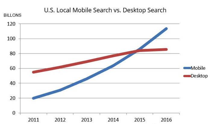
 Optimize for local search
If your business has a local element, remember to optimize your mobile content for local search. This includes standardizing your name, address, and phone number and including your city and state name in your site’s metadata. More information on local SEO can be found here.
Mobile site configuration
Probably the most important decision you’ll make when setting up a site is deciding whether you want to use a responsive, dynamic serving, or separate site configuration. Each has its advantages and disadvantages. Google prefers responsive design but supports all three options as long as you have set them up properly.
About the Author